1/
Empathise
The journey of redesigning the application began with a thorough research phase, which was crucial for understanding the needs and preferences of our users. I initiated the process by conducting a series of user interviews, aiming to gather qualitative insights directly from the end user.
These interviews were structured to explore various aspects of the current application, including usability, functionality, and overall user satisfaction. I prepared a set of open-ended questions that encouraged participants to share their experiences, challenges, and suggestions for improvement. This approach not only helped in identifying pain points but also revealed valuable features that users appreciated
Here the some findings from the research.

User Pain points
User Needs
UXD.Nikhil.Sharma@gmail.com
Interested in working together?

Redesigning a Mobile App for a Local Library
The library has approached me to redesign the app and improve the user experience, which allows users to browse and borrow books, audiobooks, and e-books.
Back to works
Client
City Library
Industry
E-Learning
Service
UI/UX Design
Team
1 UX Designer
Timeline
6 Months
Goal
The primary goal of the redesign is to create a more user-friendly and efficient library app by improving navigation and information architecture, making it easier for users to find what they need. This includes enhancing the visual design to create a more modern and engaging experience, increasing overall usability and accessibility for a diverse user base, and optimizing performance to reduce loading times and ensure smoother interactions throughout the app.
Challenges
One major challenge in redesigning the library app is navigating the cluttered and confusing user interface. Users struggle to find specific books or features due to poor information architecture, inconsistent layout, and lack of clear visual hierarchy. This creates frustration and often leads to abandonment. Simplifying the interface, reorganizing content logically, and prioritizing essential actions like search and borrowing can significantly enhance usability. Addressing this core issue is critical, as it directly impacts user satisfaction and engagement with the app.
Step 1
Empathise
Step 2
Define
Step 3
Ideate
Step 4
Prototype
Step 5
Test
Process we follow
2/
Define
To ensure the redesigned local library application met the true needs of its users, I developed detailed personas based on the user interviews and additional research. These personas represent the primary segments of library patrons, capturing their goals, Needs & Pain points

Derek Lee, 33
Tech Comfort: High
Occupation: IT Consultant
Goals
Derek uses the library app mainly to borrow audiobooks for his commute. He wants quick search by title or author, one-tap borrowing, and the ability to switch between audiobook and eBook formats when available.
Pain Points
he’s frustrated by irrelevant search results, unclear format labels, and a confusing borrowing process. The lack of trending or popular titles also makes the app feel outdated.
Needs
Derek needs smarter search with filters and predictive suggestions, clear format indicators, and a streamlined borrow flow, along with a more modern, engaging catalogue

Maria Thompson, 42
Tech Comfort: Moderate
Occupation: High School teaacher
Goals
Maria uses the app to find both educational and leisure reads, especially historical fiction and non-fiction. She wants to browse by genre, see availability instantly, and check book condition before borrowing.
Pain Points
The cluttered interface makes navigation difficult. She struggles with the lack of genre browsing, limited filters, and unclear availability or condition, leading to wasted time.
Needs
Maria needs cleaner navigation with clear genre categories, better filtering, and visible availability. Book condition labels would help her make confident borrowing choices.

Ethel Williams, 66
Tech Comfort: Low to Modreate
Occupation: Retired Nurse
Goals
Ethel enjoys reading biographies and classics on her tablet. She wants to borrow, return, and renew books easily and independently.
Pain Points
She struggles with confusing navigation, hard-to-find options, and unclear book availability, which makes the app frustrating to use.
Needs
Ethel needs a simple, accessible interface with clear text menus, large fonts, availability indicators, and guided steps for key actions. High-contrast and easy-to-read labels are essential.
Ideate
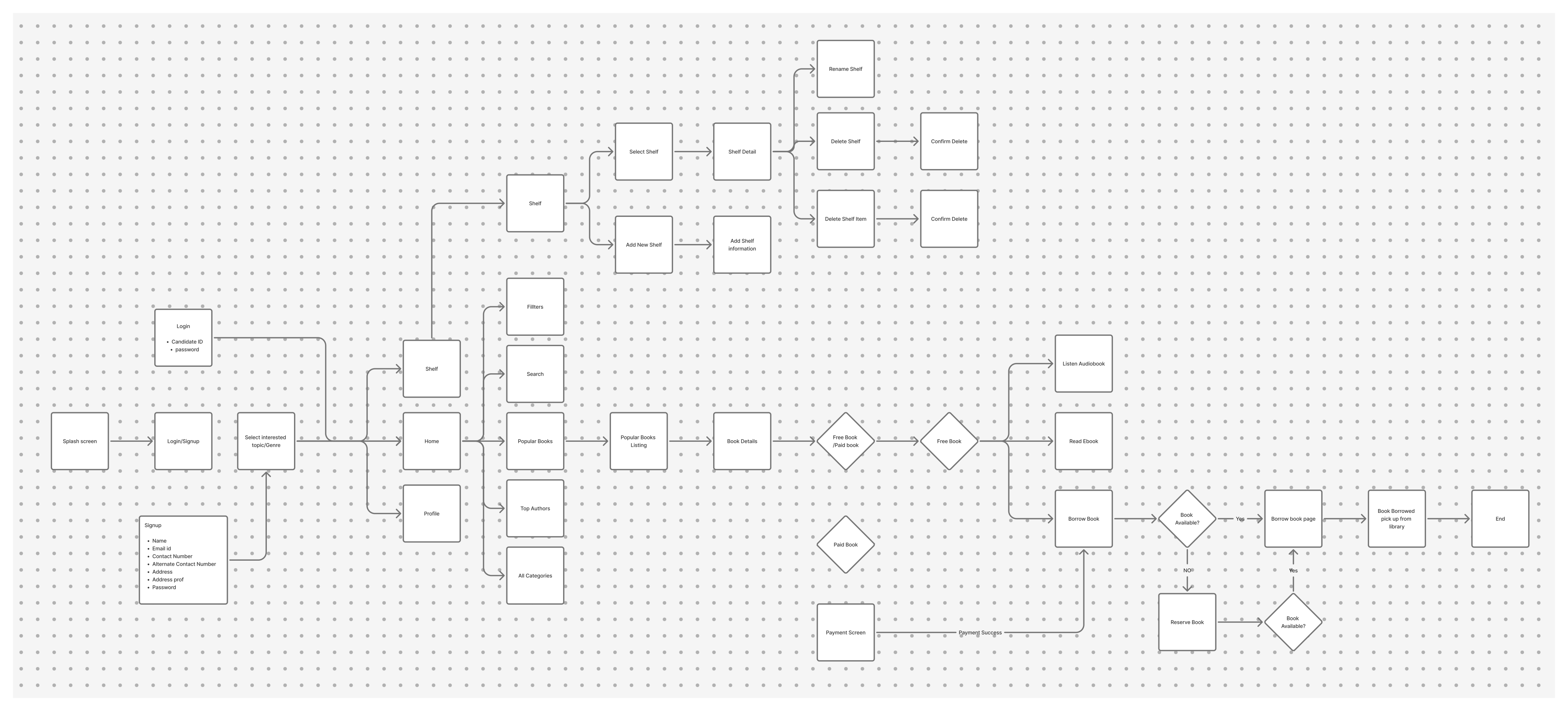
To tackle the app’s confusing navigation and cluttered layout, we focused on redesigning the user flow to prioritize clarity and ease of use. We mapped out key tasks—like searching, borrowing, and account access—and restructured the flow to make these actions more direct and accessible.
By simplifying the journey and organizing content around user goals, we laid the foundation for a cleaner, more intuitive interface that reduces friction and improves engagement.
3/
Prototype
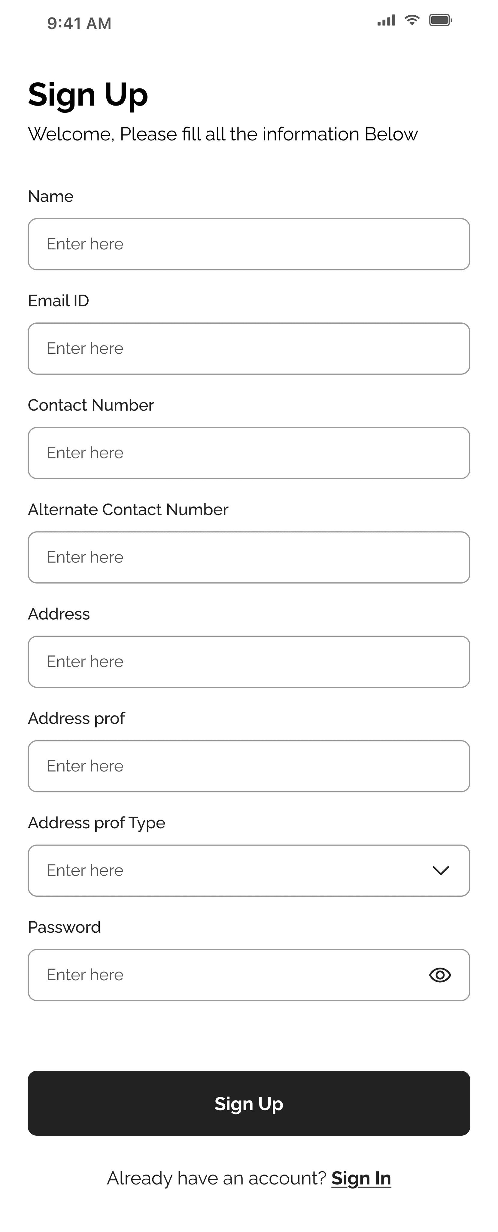
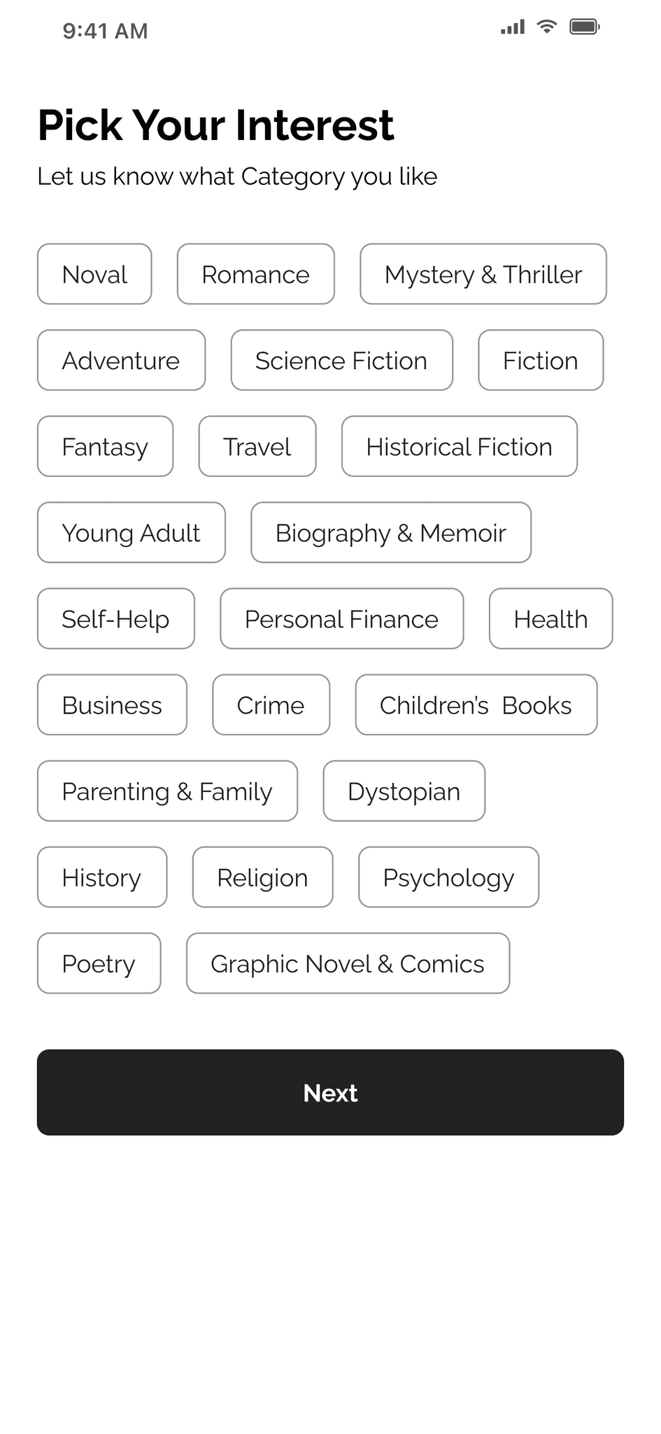
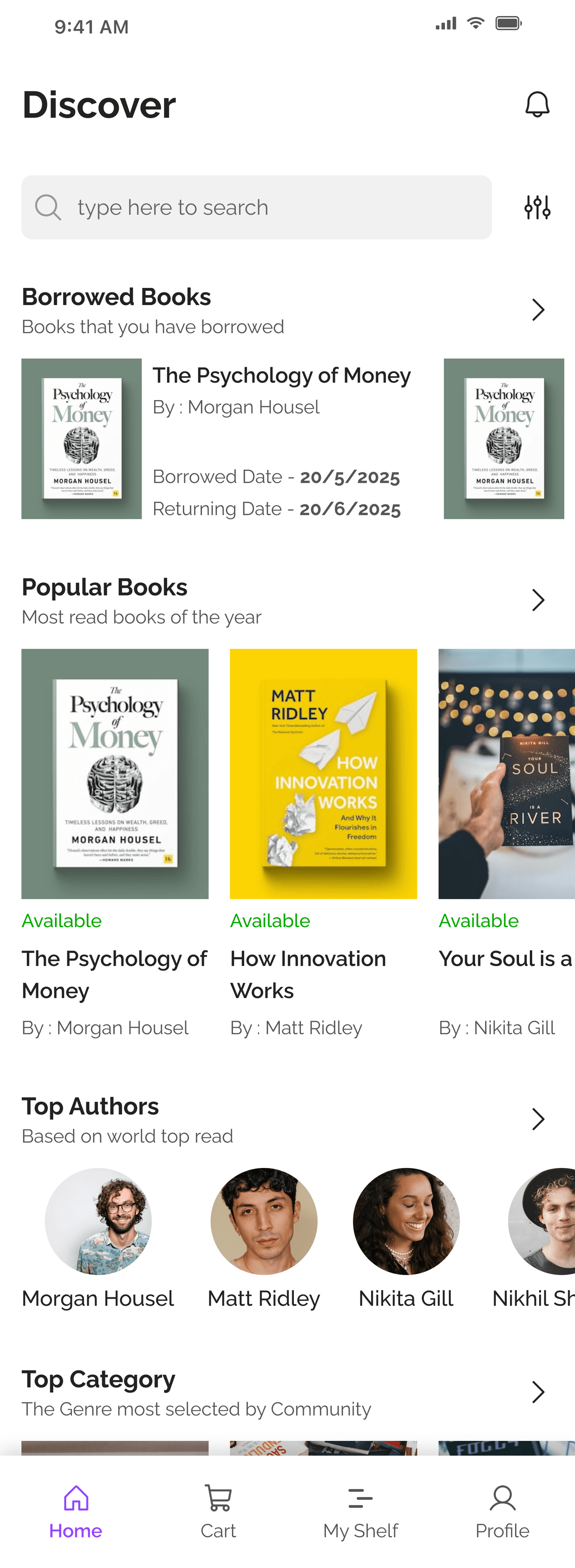
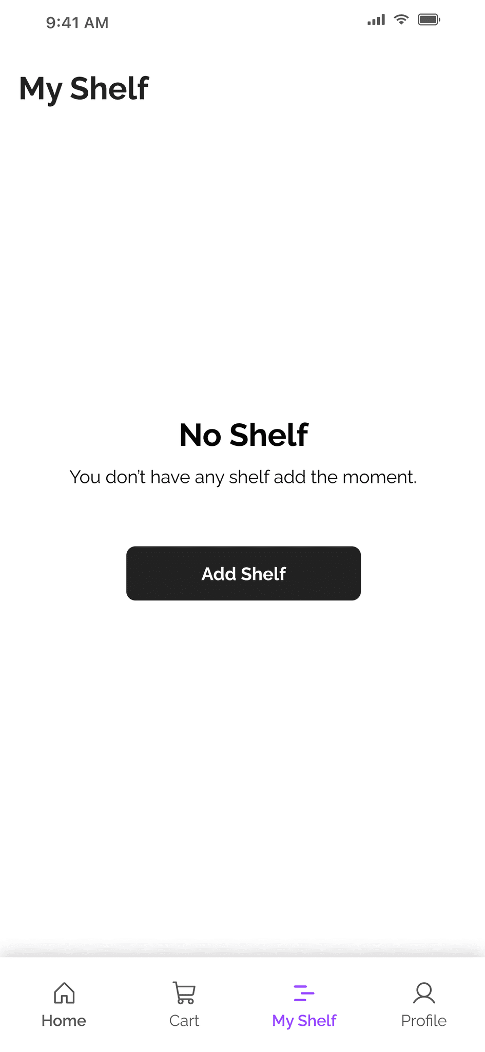
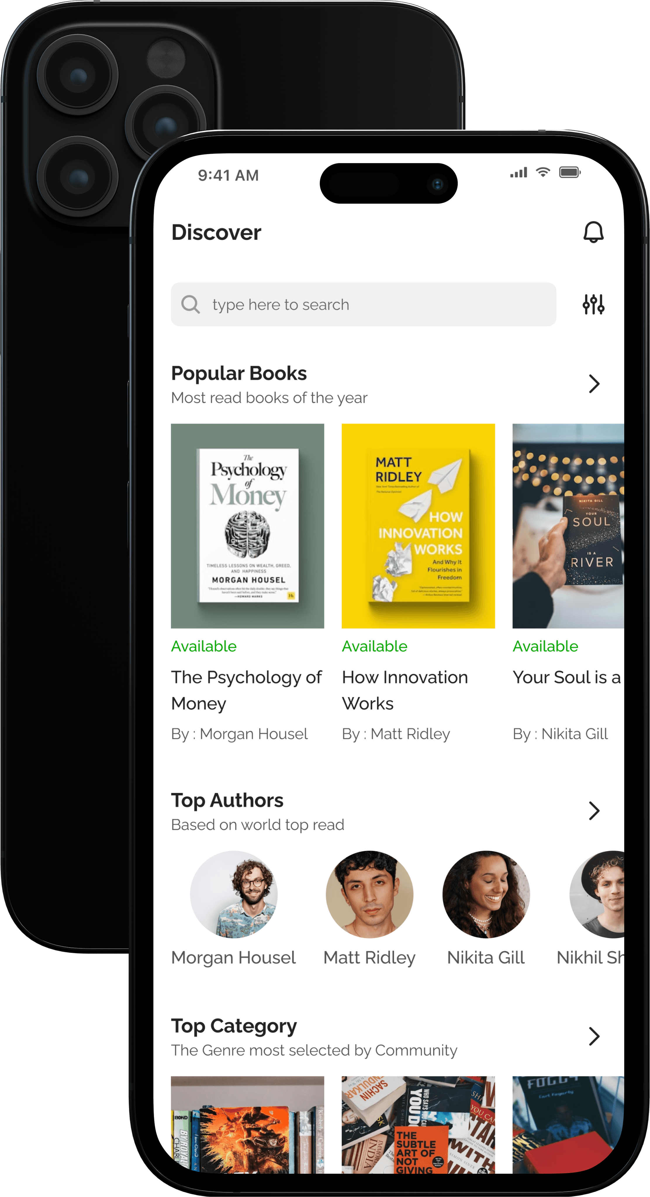
After validating the user flows with wireframes, we moved into high-fidelity mockups to bring the redesigned experience to life. The visuals focused on a clean, modern interface with clear hierarchy, consistent layout, and intuitive navigation.
Key screens included a streamlined home page with quick access to search and featured books, a refined search experience with filters, and a cohesive bottom navigation for core actions. We applied a consistent visual language—using typography, color, and spacing—to enhance usability and accessibility.
These high-fidelity mockups were used for user testing and stakeholder reviews, providing a realistic preview of the final product and helping us fine-tune visual and interaction details.
4/